
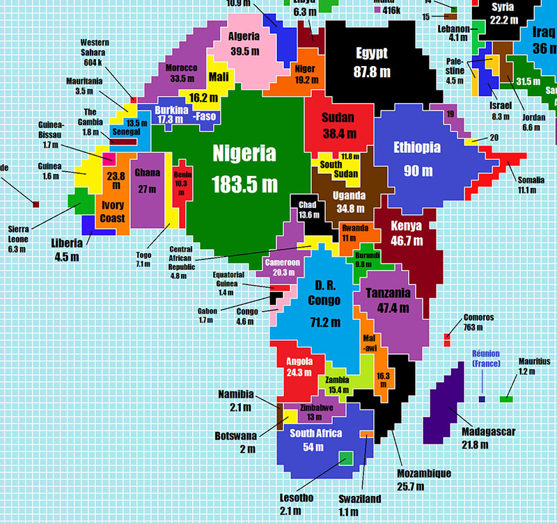
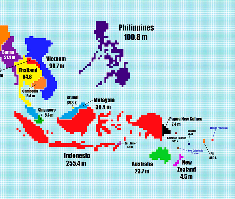
A new cartogram by Redditor Teadranks shows the countries of the world scaled by population size instead of geographic area. Each square on the map represents 500,000 people.
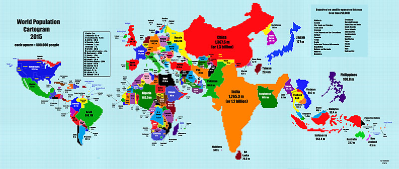
We’ve split the map into different continents below and you can view the original in high res here.
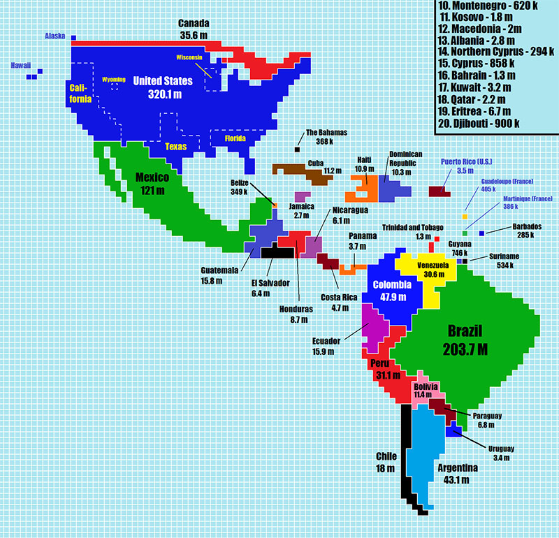
The Americas
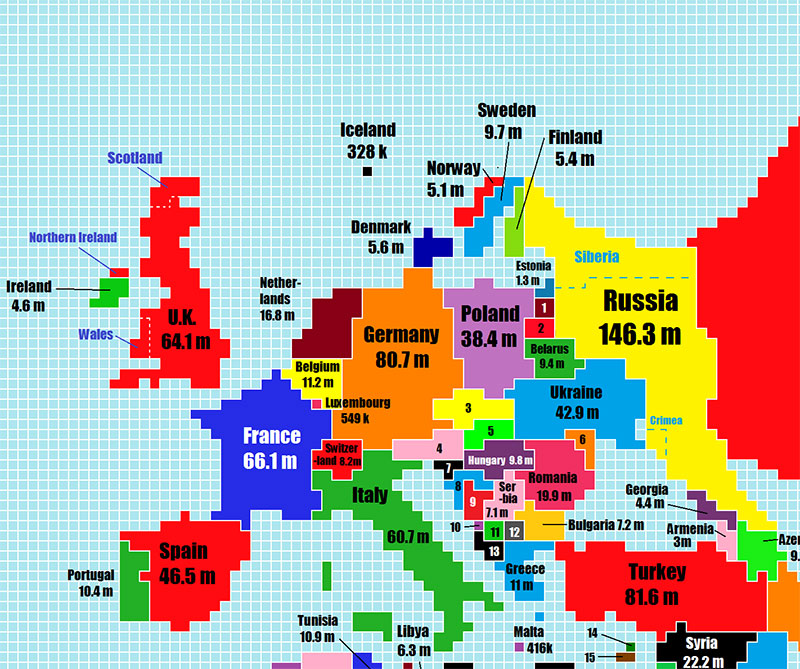
Europe
Asia
Africa
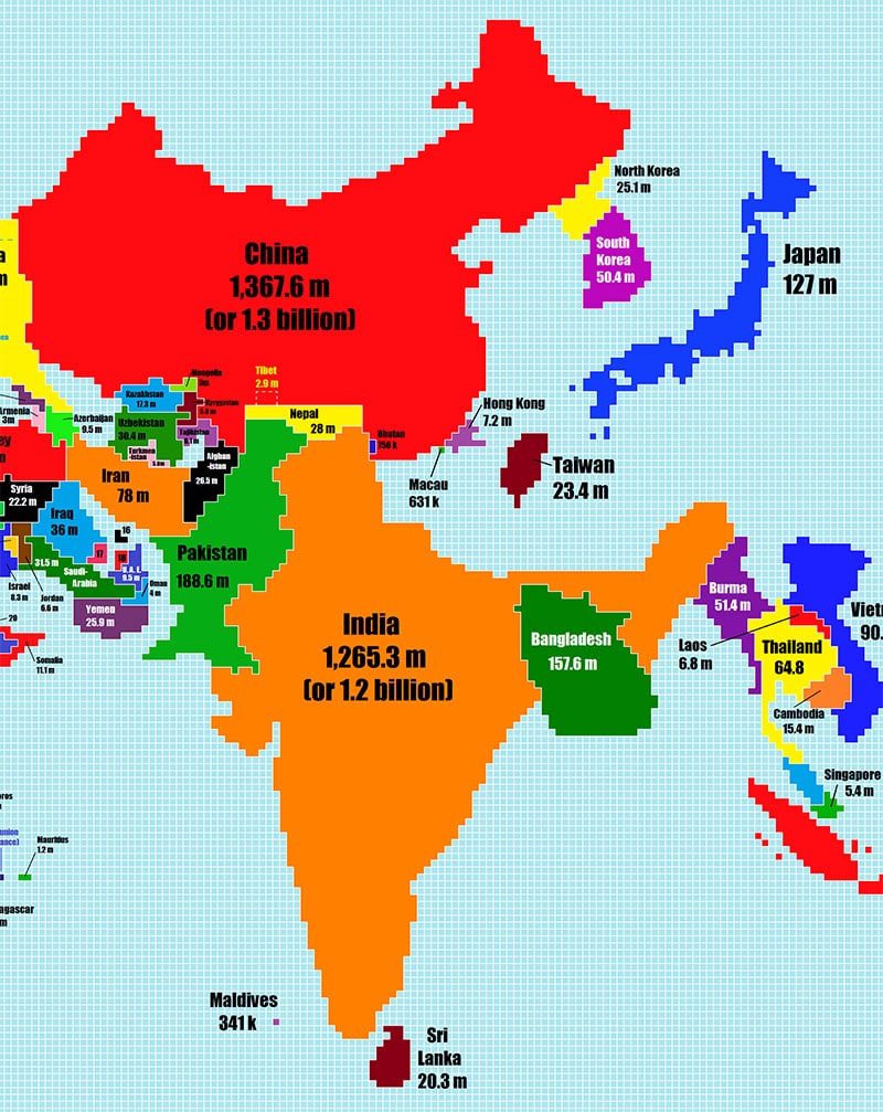
The Far East
via: IFL Science
